


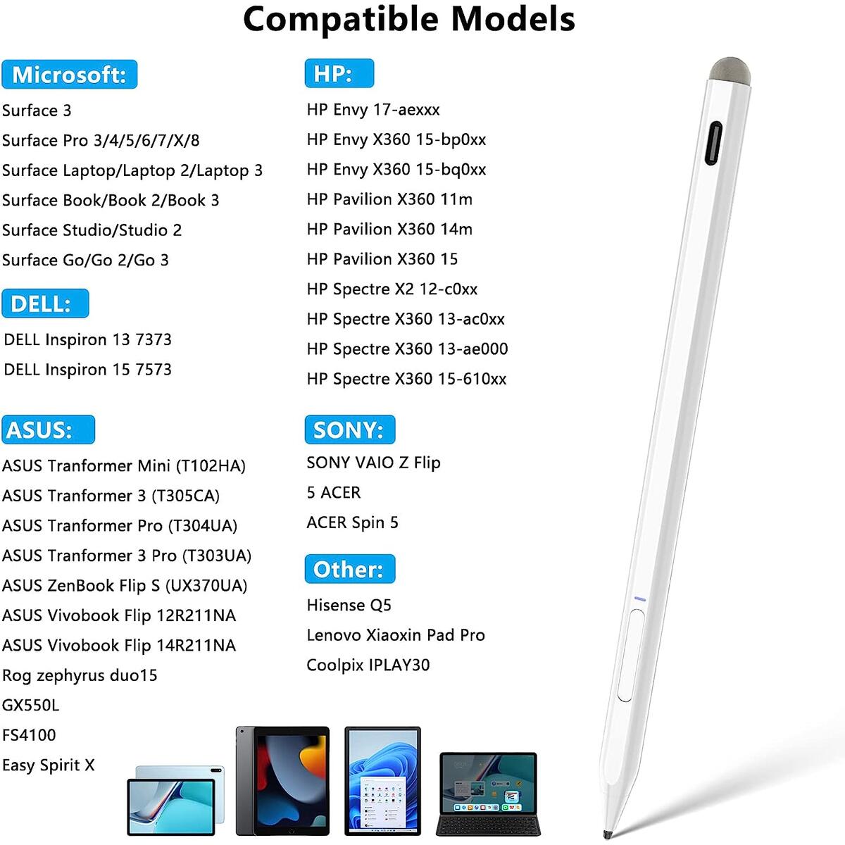


Stylus Pen for Surface, 4096 Pressure Sensitivity Microsoft Surface Pen Rechargeable, Magnetic and Palm Rejection Surface Pencil for Surface Pro 8/X/7/6/5/4/3, Surface 3/Go/Book/Laptop/Studio
90% OFF
$344.88
$34.49
YOU SAVE $310.39
$310.39
See this Stylus Pen For Surface on Shopify
Get more Coupons up to 100% for Everything Else
Note: You have to register with RebateKey.com to be able to claim a coupon for Stylus Pen For Surface.
【Compatible Models】Stylus Pen for Microsoft Surface pen compatible with Surface Pro 3/Surface Pro 4/Surface Pro 5/Surface Pro 6/ Surface Pro 7/ Surface Pro X/Surface Pro 8/Surface Pro 9/Surface 3/Surface Book/Book 2/Book 3/Surface Laptop/Laptop 2/Laptop 3/Laptop 4/Laptop 5/Surface Studio/Studio 2/Surface Go/Go 2/Go 3. Also Work ASUS/HP/Sony/DELL series. NOTE: NOT Compatible with Surface Laptop Go, Surface Laptop Go 2 and other touchscreen computers.
【Microsoft Official Authorized】Officially Authorized by Microsoft adopting the authorized chips to match surface devices, which outperforms unauthorized surface pens. The Surface stylus pen has passed Microsoft, CE, ROHS, FCC certification, which are safer and more compatible.
【4096 Pressure Sensitivity】MPP 2.0 technology, which can accurately judge the press from the surface pen tip and helps to precisely sketch and shade. Microsoft surface pen provide your highly sensitive and precise writing & painting experience when on Microsoft surface pro or surface series. NOTE: The tilt to bold function is only available for Surface Pro 5/6/7/8/X, Surface Book 2/Book 3, Surface Go/Go 2/Go 3, Surface Studio/Studio 2, Surface Laptop Studio, Surface Laptop 3/Laptop 4.
【Magnetic and Palm Rejection】 Surface Pro stylus pen can be magnetically attached to Microsoft surface. Note: Support Magnet Attach: Surface Pro 3~Pro 7, Surface Book/Book 2/Book3, Surface 3, Surface Go/Go 2/Go 3, Surface Studio/Studio 2. Not support Magnet Attach: Surface Pro 8~X, Surface Duo/Duo 2, Laptop(1st Gen)/Laptop 2/Laptop 3/Laptop 4/Laptop Studio. Palm of hand rests on the surface of screen without interference.
【Fast Charge & Longer Standby】Stylus pen for surface pro with Type-C cable supports 10 hours continuous use and 1.5 hour charging time. Built-in rechargeable battery that allows you to use this Stylus Pencil for Microsoft surface all day on full charge, auto power off after 30 minutes without use. This helps reduce battery consumption and extend battery life.
.aplus-v2 .premium-aplus-module-2 .premium-background-wrapper {
position: relative;
}
.aplus-v2 .premium-aplus-module-2 .premium-intro-wrapper {
position: absolute;
width: 50%;
height: 100%;
top: 0;
}
.aplus-v2 .premium-aplus-module-2 .premium-intro-wrapper.right {
left: 50%;
}
html[dir="rtl"] .aplus-v2 .premium-aplus-module-2 .premium-intro-wrapper.right {
left: auto;
right: 50%;
}
.aplus-v2 .premium-aplus-module-2 .premium-intro-wrapper.secondary-color {
color: #fff;
}
.aplus-v2 .premium-aplus-module-2 .premium-intro-background {
padding: 20px;
}
.aplus-v2 .premium-aplus-module-2 .aplus-module-2-topic {
padding-bottom: 10px;
}
.aplus-v2 .premium-aplus-module-2 .aplus-module-2-heading {
padding-bottom: 20px;
}
.aplus-v2 .premium-aplus-module-2 .aplus-module-2-description {
line-height: 1.5em;
}
.aplus-v2 .premium-aplus-module-2 .premium-intro-background.white-background {
background: rgba(255,255,255,0.5);
}
.aplus-v2 .premium-aplus-module-2 .premium-intro-background.black-background {
background: rgba(0,0,0,0.5);
}
.aplus-v2 .premium-aplus-module-2 .premium-intro-background.black-background,
.aplus-v2 .premium-aplus-module-2 .premium-intro-background.black-background h1,
.aplus-v2 .premium-aplus-module-2 .premium-intro-background.black-background h5,
.aplus-v2 .premium-aplus-module-2 .premium-intro-background.black-background ol,
.aplus-v2 .premium-aplus-module-2 .premium-intro-background.black-background ul,
.aplus-v2 .premium-aplus-module-2 .premium-intro-background.black-background ol .a-list-item,
.aplus-v2 .premium-aplus-module-2 .premium-intro-background.black-background ul .a-list-item {
color: #fff;
}
.aplus-v2 .premium-aplus-module-2 .premium-intro-content-container {
display: table;
height: 100%;
}
.aplus-v2 .premium-aplus-module-2 .premium-intro-wrapper.left .premium-intro-content-container {
padding-left: 40px;
}
html[dir="rtl"] .aplus-v2 .premium-aplus-module-2 .premium-intro-wrapper.left .premium-intro-content-container {
padding-left: 0px;
padding-right: 40px;
}
.aplus-v2 .premium-aplus-module-2 .premium-intro-wrapper.right .premium-intro-content-container {
padding-right: 40px;
}
html[dir="rtl"] .aplus-v2 .premium-aplus-module-2 .premium-intro-wrapper.right .premium-intro-content-container {
padding-right: 0px;
padding-left: 40px;
}
.aplus-v2 .premium-aplus-module-2 .premium-intro-content-column {
display: table-cell;
vertical-align: middle;
}
/**
* Premium modules global styles
*/
.aplus-v2.desktop {
max-width: 1464px;
min-width: 800px;
margin-left: auto;
margin-right: auto;
word-wrap: break-word;
overflow-wrap: break-word;
word-break: break-word;
}
/* Undo this for tech-specs because it breaks table layout */
.aplus-v2.desktop .premium-aplus .aplus-tech-spec-table { word-break: initial; }
.aplus-v2 .premium-aplus,
.aplus-v2 .premium-aplus .aplus-h1,
.aplus-v2 .premium-aplus .aplus-h2,
.aplus-v2 .premium-aplus .aplus-p1,
.aplus-v2 .premium-aplus .aplus-p2,
.aplus-v2 .premium-aplus .aplus-p3,
.aplus-v2 .premium-aplus .aplus-accent1,
.aplus-v2 .premium-aplus .aplus-accent2
{ font-family: Arial, sans-serif; }
.aplus-v2 .premium-aplus,
.aplus-v2 .premium-aplus .aplus-h1,
.aplus-v2 .premium-aplus .aplus-h2,
.aplus-v2 .premium-aplus .aplus-p1,
.aplus-v2 .premium-aplus .aplus-p2,
.aplus-v2 .premium-aplus .aplus-p3,
.aplus-v2 .premium-aplus .aplus-accent1,
.aplus-v2 .premium-aplus .aplus-accent2
{ font-family: inherit; }
/* type */
.aplus-v2 .premium-aplus .aplus-h1 { font-size: 32px; line-height: 1.2em; font-weight: 500; }
.aplus-v2 .premium-aplus .aplus-h2 { font-size: 26px; line-height: 1.25em; font-weight: 500; }
.aplus-v2 .premium-aplus .aplus-h3 { font-size: 18px; line-height: 1.25em; font-weight: 500; }
.aplus-v2 .premium-aplus .aplus-p1 { font-size: 20px; line-height: 1.3em; font-weight: 300; }
.aplus-v2 .premium-aplus .aplus-p2 { font-size: 16px; line-height: 1.4em; font-weight: 300; }
.aplus-v2 .premium-aplus .aplus-p3 { font-size: 14px; line-height: 1.4em; font-weight: 300; }
.aplus-v2 .premium-aplus .aplus-accent1 { font-size: 16px; line-height: 1.4em; font-weight: 600; }
.aplus-v2 .premium-aplus .aplus-accent2 { font-size: 14px; line-height: 1.4em; font-weight: 600; }
/* spacing */
.aplus-v2 .aplus-container-1 { padding: 40px; }
.aplus-v2 .aplus-container-1-2 { padding: 40px 80px; }
.aplus-v2 .aplus-container-2 { padding: 80px; }
.aplus-v2 .aplus-container-3 { padding: 40px 0; }
/* Display */
.aplus-v2 .premium-aplus .aplus-display-table { display: table; }
.aplus-v2 .premium-aplus .aplus-display-table-cell { display: table-cell; }
.aplus-v2 .premium-aplus .aplus-display-inline-block { display: inline-block; }
/* Aplus display table with min-width 1000px and fill remaining space inside parent */
.aplus-v2.desktop .premium-aplus .aplus-display-table-width { min-width: 1000px; width: 100% }
/**
* Padding and margin for element should be 10, 20, 40, or 80 px. Considering mini 10, small 20, medium 40, large 80.
*/
/*
* Used when device = desktop
* Configured in: configuration/brazil-config/global/brand-story.cfg
*/
/* Because the carousel is implemented as an ol list,
any lists in the card text will have a secondary list style (letters).
This will give an incorrect appearance to viewers,
so we set all lists to the primary list style (numbers). */
.aplus-brand-story-card ol li {
list-style: decimal;
}
/* Top level containers */
.aplus-module .apm-brand-story-hero {
-moz-box-sizing: border-box;
-webkit-box-sizing: border-box;
box-sizing: border-box;
width: 1464px;
height: 625px;
background-color: #fff;
}
.aplus-module .apm-brand-story-card {
-moz-box-sizing: border-box;
-webkit-box-sizing: border-box;
box-sizing: border-box;
width: 362px;
height: 453px;
background-color: #fff;
}
.apm-brand-story-hero,
.apm-brand-story-card {
-moz-box-sizing: border-box;
-webkit-box-sizing: border-box;
box-sizing: border-box;
position: relative;
width: 100%;
height: 100%;
float: none;
}
.aplus-module.brand-story-card-1-four-asin .apm-brand-story-card {
/* Only 12px to account for image cell border */
padding: 12px;
}
/* Full background image (Hero 1 & Card 2) */
.aplus-module .apm-brand-story-background-image {
-moz-box-sizing: border-box;
-webkit-box-sizing: border-box;
box-sizing: border-box;
overflow: hidden;
position: absolute;
width: 100%;
height: 100%;
}
/* Card 1 small images */
.aplus-module .apm-brand-story-image-row {
-moz-box-sizing: border-box;
-webkit-box-sizing: border-box;
box-sizing: border-box;
height: 185px;
padding: 0px;
margin: auto;
display: flex;
}
.aplus-module .apm-brand-story-image-row .apm-brand-story-image-cell {
/* Use content-box to ensure image size matches editor schema */
-moz-box-sizing: content-box;
-webkit-box-sizing: content-box;
box-sizing: content-box;
padding: 0px;
margin: 0px;
width: 166px;
border: 1px solid #fff;
}
.aplus-module .apm-brand-story-image-row .apm-brand-story-image-cell .apm-brand-story-image-link {
display: block;
width: 100%;
height: 100%;
}
.aplus-module .apm-brand-story-image-row .apm-brand-story-image-cell .apm-brand-story-image-link .apm-brand-story-image-img {
display: block;
width: 100%;
height: 100%;
object-fit: cover;
}
/* Card 3 logo image */
.aplus-module .apm-brand-story-logo-image {
-moz-box-sizing: content-box;
-webkit-box-sizing: content-box;
box-sizing: content-box;
height: 145px;
margin: 0px 4px;
padding: 20px;
padding-bottom: 0px;
}
/* Text overlays */
.aplus-module .apm-brand-story-text-bottom {
-moz-box-sizing: border-box;
-webkit-box-sizing: border-box;
box-sizing: border-box;
position: absolute;
bottom: 13px;
left: 13px;
}
.aplus-module .apm-brand-story-hero .apm-brand-story-text-bottom {
background-color: rgba(0,0,0,0.6);
color: #fff;
padding: 13px 65px 13px 13px; /* accounts for overlap of first card */
width: 437px;
}
.aplus-module.brand-story-card-2-media-asset .apm-brand-story-text-bottom {
background-color: rgba(255,255,255,0.6);
color: #000;
padding: 13px;
width: 336px;
}
.aplus-module.brand-story-card-1-four-asin .apm-brand-story-text {
margin-top: 8px;
}
.aplus-module.brand-story-card-1-four-asin .apm-brand-story-text.apm-brand-story-text-single {
margin-top: 20px;
}
.aplus-module.brand-story-card-1-four-asin .apm-brand-story-text h3 {
white-space: nowrap;
overflow: hidden;
text-overflow: ellipsis;
}
.aplus-module .apm-brand-story-slogan-text {
-moz-box-sizing: content-box;
-webkit-box-sizing: content-box;
box-sizing: content-box;
margin: 0px 4px;
padding: 20px;
}
.aplus-module .apm-brand-story-faq {
-moz-box-sizing: content-box;
-webkit-box-sizing: content-box;
box-sizing: content-box;
padding-top: 10px;
}
.aplus-module .apm-brand-story-faq-block {
margin: 0px 10px;
padding: 10px;
}
.aplus-v2 .apm-brand-story-carousel-container {
position: relative;
}
.aplus-v2 .apm-brand-story-carousel-hero-container,
.aplus-v2 .apm-brand-story-carousel-hero-container > div {
position: absolute;
width: 100%;
}
/*
Ensuring the carousel takes only the space it needs.
The sizes need to be set again on the absolutely positioned elements so they can take up space.
*/
.aplus-v2 .apm-brand-story-carousel-container,
.aplus-v2 .apm-brand-story-carousel-hero-container {
height: 625px;
width: calc(100% + 15px);
max-width: 1464px;
margin-left: auto;
margin-right: auto;
}
/*
This centers the carousel vertically on top of the hero image container and after the logo area (125px).
Margin-top = (heroHeight - cardHeight - logoAreaHeight) / 2 + logoAreaHeight
*/
.aplus-v2 .apm-brand-story-carousel .a-carousel-row-inner{
margin-top: 149px;
}
/*
Cards need to have a width set, otherwise they default to 50px or so.
All cards must have the same width. The carousel will resize itself so all cards take the width of the largest card.
The left margin is for leaving a space between each card.
*/
.aplus-v2 .apm-brand-story-carousel .a-carousel-card {
width: 362px;
margin-left: 30px !important;
}
/* styling the navigation buttons so they are taller, flush with the sides, and have a clean white background */
.aplus-v2 .apm-brand-story-carousel .a-carousel-col.a-carousel-left,
.aplus-v2 .apm-brand-story-carousel .a-carousel-col.a-carousel-right {
padding: 0px;
}
.aplus-v2 .apm-brand-story-carousel .a-carousel-col.a-carousel-left .a-button-image,
.aplus-v2 .apm-brand-story-carousel .a-carousel-col.a-carousel-right .a-button-image {
border: none;
margin: 0px;
}
.aplus-v2 .apm-brand-story-carousel .a-carousel-col.a-carousel-left .a-button-image .a-button-inner,
.aplus-v2 .apm-brand-story-carousel .a-carousel-col.a-carousel-right .a-button-image .a-button-inner {
background: #fff;
padding: 20px 6px;
}
.aplus-v2 .apm-brand-story-carousel .a-carousel-col.a-carousel-left .a-button-image .a-button-inner {
border-radius: 0px 4px 4px 0px;
}
.aplus-v2 .apm-brand-story-carousel .a-carousel-col.a-carousel-right .a-button-image .a-button-inner {
border-radius: 4px 0px 0px 4px;
}
See what our users are saying!

Karen

Chalida

Lena

Maxenne

Taylor

Daniella

Amber

Raymond

Tanya
You'd like to get access to hundreds of deals?
Join tens of thousands of smart and happy shoppers! What are you waiting for?
Sign Up Now!Discover more deals...


So, what are you waiting for?
Sign Up Now!Be part of RebateKey
Join tens of thousands of smart and happy shoppers! What are you waiting for?
Start Now!