


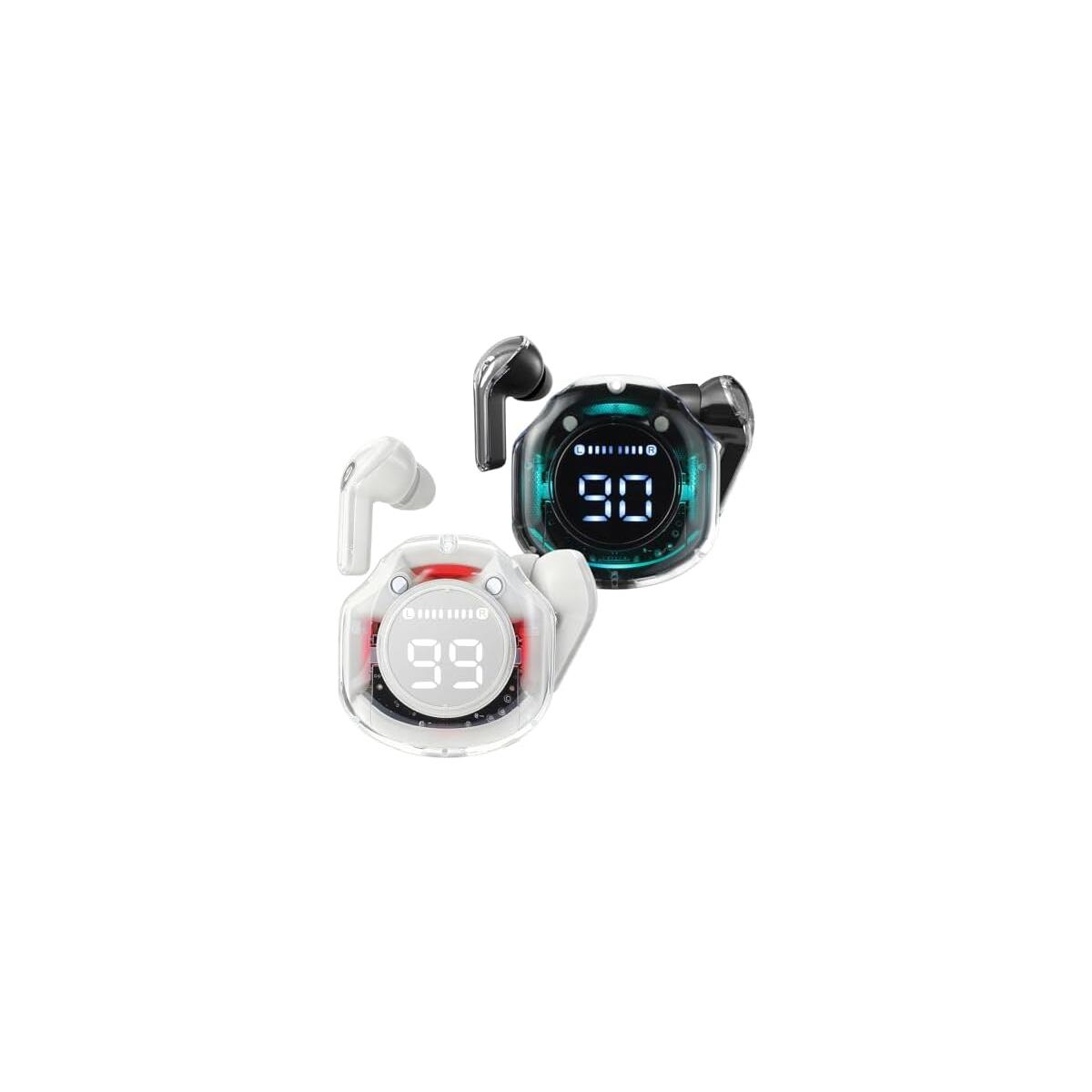
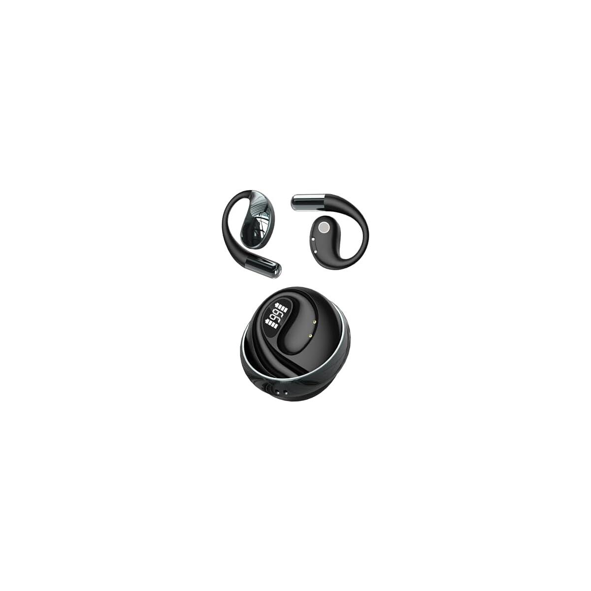
Wireless Earbuds,Bluetooth Earbuds Bluetooth 5.3 Headphones 36H Playtime LED Power Display Earbuds Stereo Sound Deep Bass Crystal-Clear Calls Headset with Charging Case for iPhone/Samsung/Android
$267.96
$26.80
Note: You have to register with RebateKey.com to be able to claim a coupon for Wireless Earbuds Bluetooth Earbuds.
Brand: RICOO
Color: Black-B
Features:
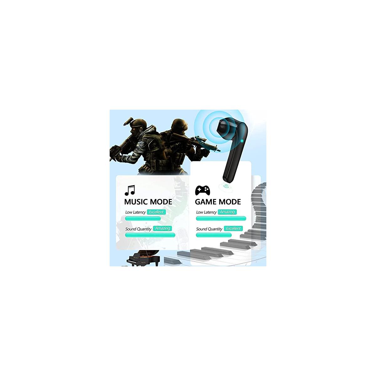
- 👍【Latest Bluetooth 5.3】: Sports wireless Bluetooth headphones are equipped with a Bluetooth 5.3 chip for high-quality stereo sound,powerful bass,and low latency when playing or making videos.They connect easily to your devices, providing excellent compatibility and stability.The headphones allow you to enjoy a stable connection while listening to music and making calls.
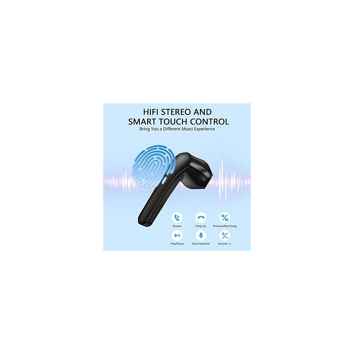
- 👍【Premium Sound Quality】: Each Bluetooth headset has two microphones.These four improved microphones offer noise-canceling call technology that effectively blocks out 80% of background noise,providing a balanced and natural sound with excellent dynamic range and outstanding accuracy.
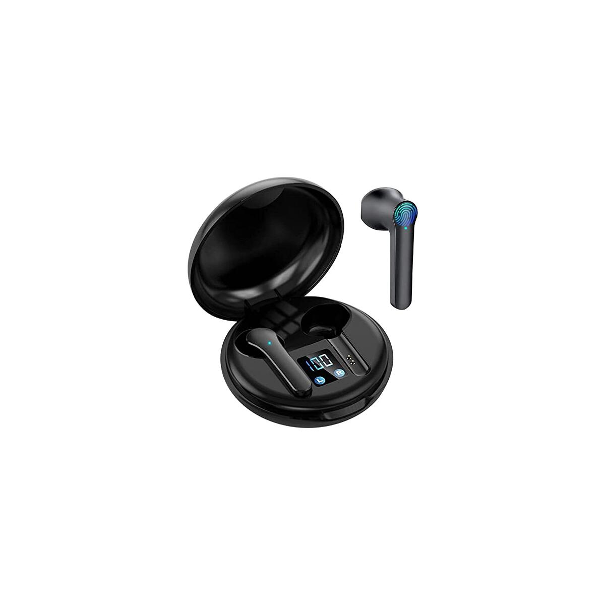
- 👍【Long battery life】: sporty wireless Bluetooth headset with compact Type-C,LED screen charging case that shows battery level and allows 3-4 hours of listening on a single charge,extended to 36 hours with the charging case.Always ready to have fun with you.This true wireless headset quickly connects to your Bluetooth phone/laptop/TV so you can watch lots of movies,play games,and listen to music.
- 👍【Easy pairing and touch】: When removed from the case,the two wireless headsets will automatically connect.Within seconds,you will enter the world of pleasant music.With the buttons you can easily perform different functions,control media and calls,forward,backward,play,pause,volume +,volume,answer and reject calls.
- 👍【24 Hour Online Service】: Select delivery [Amazon Deliveries] for next-day Amazon service and exclusive offers.Built-in 2 x Bluetooth sports headset,1 x charging case,1 x charging cable, and 1 x user manual.We offer a 24-month quality warranty with free replacement or refund within 180 days Lifetime technical support and 24-hour online response to your queries.
model number: JS82
Part Number: RICOO
Details: ❤New Bluetooth 5.3 True Wireless Earbuds
Our brand is a professional brand focusing on wireless earphones. We are committed to providing people with the best wireless audio products and creating a completely wireless lifestyle. Wireless life is a trend, a new idea. Easy to connect, easy to live.
Product Specifications
Product name: wireless Bluetooth JS82
Bluetooth version: V5.23+EDR ultra-low power consumption
Frequency: 2.4GHz
Microphone Sensitivity: 42dB
Bluetooth distance: about 15 meters
Battery capacity: 65mAh (Bluetooth headset) / 600mAh (charging box).
Charging power supply: DC5V
Standby time: up to 100 hours
Music/talk time: 5-6 hours
feature:
Super easy pairing process
First use - remove the Bluetooth headset from the charging case and connect via the phone's Bluetooth menu.
Second use - just remove the earphones from the charging case and the earphones will automatically connect to your phone.
where to take the music
IPX7 sweat-resistant, the wireless earphones feature a reliable waterproof and sweat-resistant nano-coating for high-intensity workouts or sports in light rain for improved durability.
long game time
Built-in polymer lithium battery. A single charge will give you 5-6 hours of talk time/audio playback time, enough for a week's worth of music workouts.
Package accessories include:
► Charging case x 1
► USB cable x 1
► User Manual x 1
►Wireless Earbuds x 2
►Silicone protective case x 1
If you receive it, please fully charge it before using it. If you have any unpleasantness, please contact us immediately.
EAN: 8222427783935
See what our users are saying!

Raymond

Chalida

Taylor

Tanya

Maxenne

Amber

Karen

Daniella

Lena
You'd like to get access to hundreds of deals?
Join tens of thousands of smart and happy shoppers! What are you waiting for?
Sign Up Now!More from that seller...

Discover more deals...

![[Built-in Apps] Smart Projector with WiFi and Bluetooth, VIZONY Native 1080P Projector with Streaming APPs, Dolby Audio, Portable Mini Projector for Indoor Outdoor Use](https://rebatekey-production.s3.us-east-2.amazonaws.com/files/coupons/y/i/w/6/6/yiw66.jpg)

So, what are you waiting for?
Sign Up Now!Be part of RebateKey
Join tens of thousands of smart and happy shoppers! What are you waiting for?
Start Now!