
Best US Deals, Coupons and Promo Codes
Find Great Deals in a Flash! Check out the Coupons and Promo Codes offered by Amazon, Walmart, eBay and more. At RebateKey.com, we offer the best product deals, online coupons, and promo codes directly from merchants, including Macy's, Amazon, Best Buy, Walmart and thousands of other popular brands! Sign Up Now, it's FREE


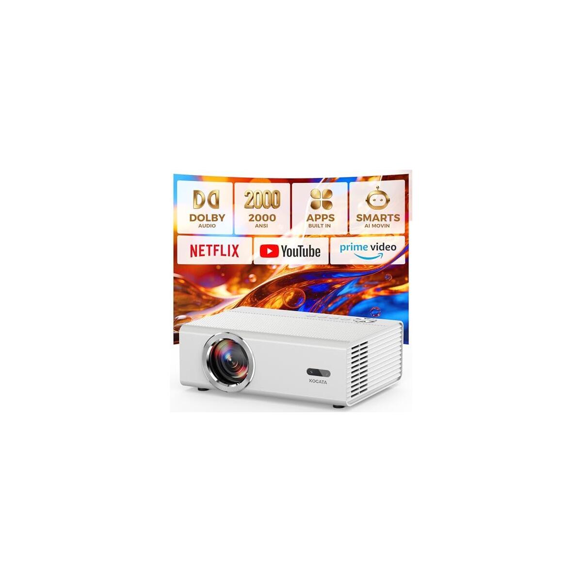
![[Built-in Apps] Smart Projector with WiFi and Bluetooth, VIZONY Native 1080P Projector with Streaming APPs, Dolby Audio, Portable Mini Projector for Indoor Outdoor Use](https://rebatekey-production.s3.us-east-2.amazonaws.com/files/coupons/y/i/w/6/6/yiw66.jpg)
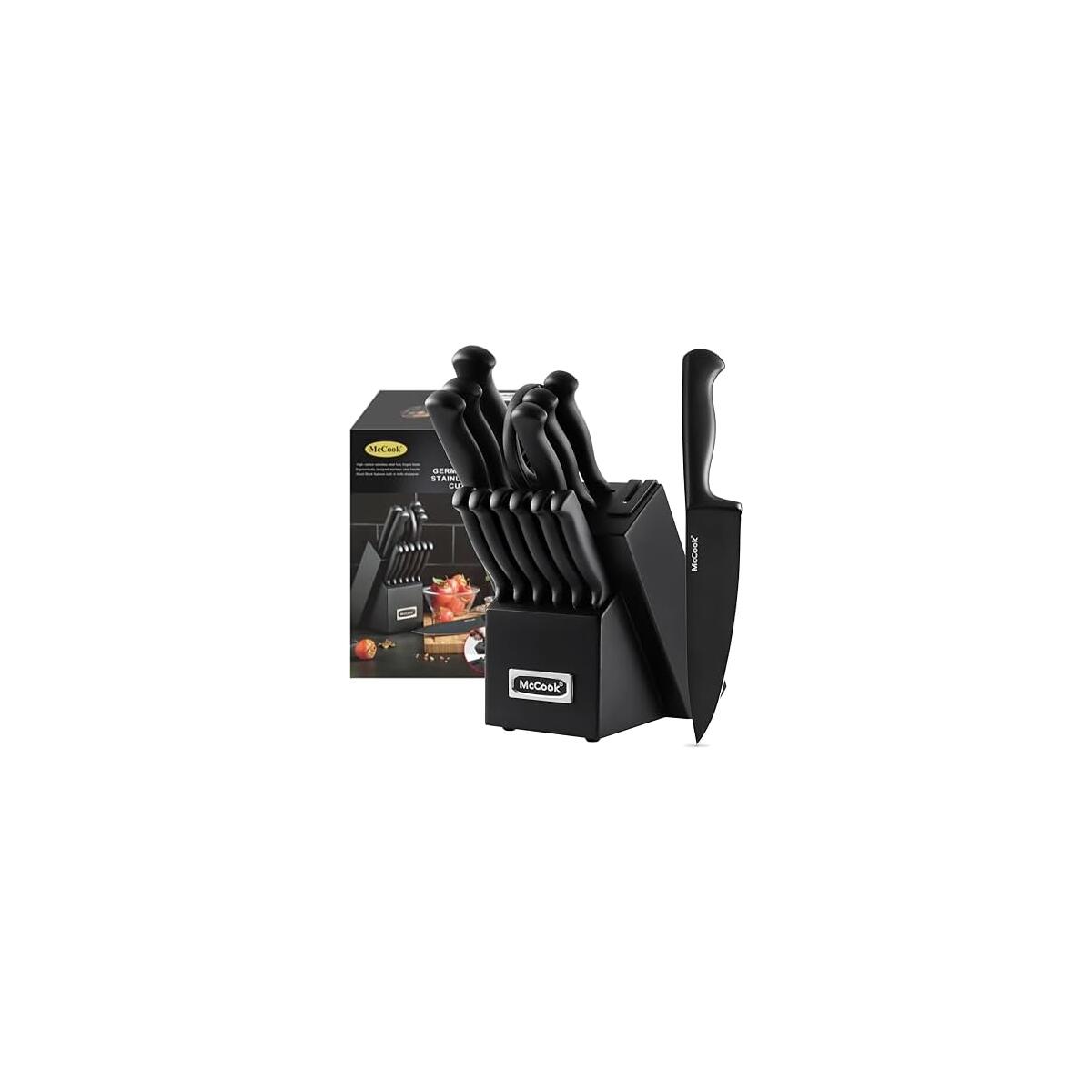
McCook® Knife Sets,German Stainless Steel Knife Block Sets with Built-in Sharpener, Black
$119.99
$59.99
$60.00 OFF
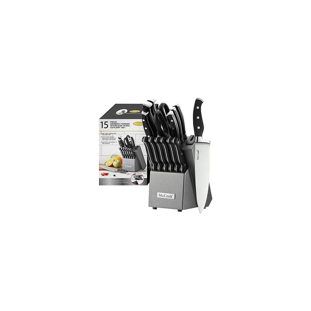
McCook® Knife Sets,German Stainless Steel Kitchen Knife Block Set with Built-in Sharpener
$99.99
$52.98
$47.01 OFF


No more deals
No more pages to load
Be part of RebateKey
Join tens of thousands of smart and happy shoppers! What are you waiting for?
Start Now!