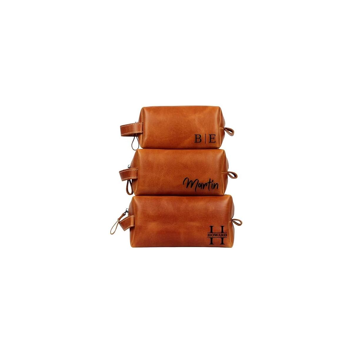
Toiletry Bag for Men, Water-resistant Dopp Kit with Double Side Full Open Design, Large Capacity for Toiletries and Shaving Accessories, Travel Toiletry Organizer Case, Grey

90% OFF
$206.89

$20.69

YOU SAVE $186.20 $186.20
See this Toiletry Bag For Men on Shopify Get more Coupons up to 100% for Everything Else
Get Coupon Code

Note: You have to register with RebateKey.com to be able to claim a coupon for Toiletry Bag For Men.


LARGE CAPACITY: 11.5 x 4.5 x 7 inches. The main compartment can easily store full-size toiletries and shaving supplies. There are multiple pockets inside to neatly store all your personal items.
WATER-RESISTANT: Made of durable and water-resistent material, it is not afraid of splashing water and can protect the items in the bag well.
ORGANIZED COMPARTMENTS: The side compartments can be laid flat to search without opening the main compartment. The elastic band and multiple pockets are perfect for a toothbrush, razor, electric trimmer or other small items.
EASY ACCESS: Sturdy double zipper for easy access to items. Use the magnetic snap to quickly open the top flap to cover the main compartment.
APPLICABLE OCCASION: Suitable for family use or a week trip. The size is designed to fit in the sink, backpack or suitcase.
.aplus-v2 {
display: block;
margin-left: auto;
margin-right: auto;
}
.aplus-v2 .aplus-3p-fixed-width {
width: 970px;
}
.aplus-v2 .aplus-3p-fixed-width.aplus-module-wrapper {
margin-left: auto;
margin-right: auto;
}

/*
* Used when device = desktop
* Configured in: configuration/brazil-config/global/brand-story.cfg
*/

/* Because the carousel is implemented as an ol list,
any lists in the card text will have a secondary list style (letters).
This will give an incorrect appearance to viewers,
so we set all lists to the primary list style (numbers). */
.aplus-brand-story-card ol li {
list-style: decimal;
}

/* Top level containers */
.aplus-module .apm-brand-story-hero {
-moz-box-sizing: border-box;
-webkit-box-sizing: border-box;
box-sizing: border-box;
width: 1464px;
height: 625px;
background-color: #fff;
}

.aplus-module .apm-brand-story-card {
-moz-box-sizing: border-box;
-webkit-box-sizing: border-box;
box-sizing: border-box;
width: 362px;
height: 453px;
background-color: #fff;
}

.apm-brand-story-hero,
.apm-brand-story-card {
-moz-box-sizing: border-box;
-webkit-box-sizing: border-box;
box-sizing: border-box;
position: relative;
width: 100%;
height: 100%;
float: none;
}

.aplus-module.brand-story-card-1-four-asin .apm-brand-story-card {
/* Only 12px to account for image cell border */
padding: 12px;
}

/* Full background image (Hero 1 & Card 2) */
.aplus-module .apm-brand-story-background-image {
-moz-box-sizing: border-box;
-webkit-box-sizing: border-box;
box-sizing: border-box;
overflow: hidden;
position: absolute;
width: 100%;
height: 100%;
}

/* Card 1 small images */
.aplus-module .apm-brand-story-image-row {
-moz-box-sizing: border-box;
-webkit-box-sizing: border-box;
box-sizing: border-box;
height: 185px;
padding: 0px;
margin: auto;
display: flex;
}

.aplus-module .apm-brand-story-image-row .apm-brand-story-image-cell {
/* Use content-box to ensure image size matches editor schema */
-moz-box-sizing: content-box;
-webkit-box-sizing: content-box;
box-sizing: content-box;
padding: 0px;
margin: 0px;
width: 166px;
border: 1px solid #fff;
}

.aplus-module .apm-brand-story-image-row .apm-brand-story-image-cell .apm-brand-story-image-link {
display: block;
width: 100%;
height: 100%;
}

.aplus-module .apm-brand-story-image-row .apm-brand-story-image-cell .apm-brand-story-image-link .apm-brand-story-image-img {
display: block;
width: 100%;
height: 100%;
object-fit: cover;
}

/* Card 3 logo image */
.aplus-module .apm-brand-story-logo-image {
-moz-box-sizing: content-box;
-webkit-box-sizing: content-box;
box-sizing: content-box;
height: 145px;
margin: 0px 4px;
padding: 20px;
padding-bottom: 0px;
}

/* Text overlays */
.aplus-module .apm-brand-story-text-bottom {
-moz-box-sizing: border-box;
-webkit-box-sizing: border-box;
box-sizing: border-box;
position: absolute;
bottom: 13px;
left: 13px;
}

.aplus-module .apm-brand-story-hero .apm-brand-story-text-bottom {
background-color: rgba(0,0,0,0.6);
color: #fff;
padding: 13px 65px 13px 13px; /* accounts for overlap of first card */
width: 437px;
}

.aplus-module.brand-story-card-2-media-asset .apm-brand-story-text-bottom {
background-color: rgba(255,255,255,0.6);
color: #000;
padding: 13px;
width: 336px;
}

.aplus-module.brand-story-card-1-four-asin .apm-brand-story-text {
margin-top: 8px;
}

.aplus-module.brand-story-card-1-four-asin .apm-brand-story-text.apm-brand-story-text-single {
margin-top: 20px;
}

.aplus-module.brand-story-card-1-four-asin .apm-brand-story-text h3 {
white-space: nowrap;
overflow: hidden;
text-overflow: ellipsis;
}

.aplus-module .apm-brand-story-slogan-text {
-moz-box-sizing: content-box;
-webkit-box-sizing: content-box;
box-sizing: content-box;
margin: 0px 4px;
padding: 20px;
}

.aplus-module .apm-brand-story-faq {
-moz-box-sizing: content-box;
-webkit-box-sizing: content-box;
box-sizing: content-box;
padding-top: 10px;
}

.aplus-module .apm-brand-story-faq-block {
margin: 0px 10px;
padding: 10px;
}

.aplus-v2 .apm-brand-story-carousel-container {
position: relative;
}

.aplus-v2 .apm-brand-story-carousel-hero-container,
.aplus-v2 .apm-brand-story-carousel-hero-container > div {
position: absolute;
width: 100%;
}

/*
Ensuring the carousel takes only the space it needs.
The sizes need to be set again on the absolutely positioned elements so they can take up space.
*/
.aplus-v2 .apm-brand-story-carousel-container,
.aplus-v2 .apm-brand-story-carousel-hero-container {
height: 625px;
width: calc(100% + 15px);
max-width: 1464px;
margin-left: auto;
margin-right: auto;
}

/*
This centers the carousel vertically on top of the hero image container and after the logo area (125px).
Margin-top = (heroHeight - cardHeight - logoAreaHeight) / 2 + logoAreaHeight
*/
.aplus-v2 .apm-brand-story-carousel .a-carousel-row-inner{
margin-top: 149px;
}

/*
Cards need to have a width set, otherwise they default to 50px or so.
All cards must have the same width. The carousel will resize itself so all cards take the width of the largest card.
The left margin is for leaving a space between each card.
*/
.aplus-v2 .apm-brand-story-carousel .a-carousel-card {
width: 362px;
margin-left: 30px !important;
}

/* styling the navigation buttons so they are taller, flush with the sides, and have a clean white background */
.aplus-v2 .apm-brand-story-carousel .a-carousel-col.a-carousel-left,
.aplus-v2 .apm-brand-story-carousel .a-carousel-col.a-carousel-right {
padding: 0px;
}

.aplus-v2 .apm-brand-story-carousel .a-carousel-col.a-carousel-left .a-button-image,
.aplus-v2 .apm-brand-story-carousel .a-carousel-col.a-carousel-right .a-button-image {
border: none;
margin: 0px;
}

.aplus-v2 .apm-brand-story-carousel .a-carousel-col.a-carousel-left .a-button-image .a-button-inner,
.aplus-v2 .apm-brand-story-carousel .a-carousel-col.a-carousel-right .a-button-image .a-button-inner {
background: #fff;
padding: 20px 6px;
}

.aplus-v2 .apm-brand-story-carousel .a-carousel-col.a-carousel-left .a-button-image .a-button-inner {
border-radius: 0px 4px 4px 0px;
}

.aplus-v2 .apm-brand-story-carousel .a-carousel-col.a-carousel-right .a-button-image .a-button-inner {
border-radius: 4px 0px 0px 4px;
}

See what our users are saying!

Taylor

Taylor

Amber

Amber

Lena

Lena

Raymond

Raymond

Chalida

Chalida

Tanya

Tanya

Maxenne

Maxenne

Karen

Karen

Daniella

Daniella

You'd like to get access to hundreds of deals?

Join tens of thousands of smart and happy shoppers! What are you waiting for?

Sign Up Now!

More from that seller...

Discover more deals...

So, what are you waiting for?

Sign Up Now!
Trusted Marketplaces

Be part of RebateKey

Join tens of thousands of smart and happy shoppers! What are you waiting for?

Start Now!