


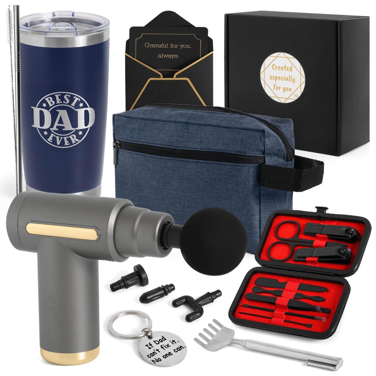
Professional Pedicure Kit, Rosmax 36 in 1 Pedicure Tools Stainless Steel Washable Foot Care Kit Dead Skin Remover Foot Spa Set at Home
$99.80
$9.98
Note: You have to register with RebateKey.com to be able to claim a coupon for Professional Pedicure Kit Rosmax.
Product Description
.aplus-v2 {
display: block;
margin-left: auto;
margin-right: auto;
}
.aplus-v2 .aplus-3p-fixed-width {
width: 970px;
}
.aplus-v2 .aplus-3p-fixed-width.aplus-module-wrapper {
margin-left: auto;
margin-right: auto;
}
.aplus-v2 {
display:block;
margin-left:auto;
margin-right:auto;
word-wrap: break-word;
overflow-wrap: break-word;
word-break: break-word;
}
/* Undo this for tech-specs because it breaks table layout */
.aplus-v2 .aplus-standard .aplus-tech-spec-table { word-break: initial; }
.aplus-v2 .aplus-standard .aplus-module-wrapper {text-align:inherit; display:block; margin-right:auto;margin-left:auto;}
.aplus-v2 .aplus-standard.aplus-module.module-1,
.aplus-v2 .aplus-standard.aplus-module.module-2,
.aplus-v2 .aplus-standard.aplus-module.module-3,
.aplus-v2 .aplus-standard.aplus-module.module-4,
.aplus-v2 .aplus-standard.aplus-module.module-6,
.aplus-v2 .aplus-standard.aplus-module.module-7,
.aplus-v2 .aplus-standard.aplus-module.module-8,
.aplus-v2 .aplus-standard.aplus-module.module-9,
.aplus-v2 .aplus-standard.aplus-module.module-10,
.aplus-v2 .aplus-standard.aplus-module.module-11,
.aplus-v2 .aplus-standard.aplus-module.module-12{padding-bottom:12px; margin-bottom:12px;}
.aplus-v2 .aplus-standard.aplus-module:last-child{border-bottom:none}
.aplus-v2 .aplus-standard.aplus-module {min-width:979px;}
/* aplus css needed to override aui on the detail page */
.aplus-v2 .aplus-standard.aplus-module table.aplus-chart.a-bordered.a-vertical-stripes {border:none;}
.aplus-v2 .aplus-standard.aplus-module table.aplus-chart.a-bordered.a-vertical-stripes td {background:none;}
.aplus-v2 .aplus-standard.aplus-module table.aplus-chart.a-bordered.a-vertical-stripes td.selected {background-color:#ffd;}
.aplus-v2 .aplus-standard.aplus-module table.aplus-chart.a-bordered.a-vertical-stripes td:first-child {background:#f7f7f7; font-weight:bold;}
.aplus-v2 .aplus-standard.aplus-module table.aplus-chart.a-bordered.a-vertical-stripes tr th {background:none; border-right:none;}
.aplus-v2 .aplus-standard.aplus-module table.aplus-chart.a-bordered tr td,.aplus-v2 .aplus-standard .aplus-module table.aplus-chart.a-bordered tr th {border-bottom:1px dotted #999;}
/* A+ Template - General Module CSS */
.aplus-v2 .aplus-standard .apm-top {height:100%; vertical-align:top;}
html[dir='rtl'] .aplus-v2 .aplus-standard .apm-top {padding-left: 0px; padding-right: 3px}
.aplus-v2 .aplus-standard .apm-center {height:100%; vertical-align:middle; text-align:center;}
.aplus-v2 .aplus-standard .apm-row {width:100%; display:inline-block;}
.aplus-v2 .aplus-standard .apm-wrap {width:100%;}
.aplus-v2 .aplus-standard .apm-fixed-width {width:969px;}
.aplus-v2 .aplus-standard .apm-floatleft {float:left;}
html[dir='rtl'] .aplus-v2 .aplus-standard .apm-floatleft {float:right;}
.aplus-v2 .aplus-standard .apm-floatright {float:right;}
html[dir='rtl'] .aplus-v2 .aplus-standard .apm-floatright {float:left;}
.aplus-v2 .aplus-standard .apm-floatnone {float:none;}
.aplus-v2 .aplus-standard .apm-spacing img {border:none;}
.aplus-v2 .aplus-standard .apm-leftimage {float:left; display:block; margin-right:20px; margin-bottom:10px;width: 300px;}
html[dir='rtl'] .aplus-v2 .aplus-standard .apm-leftimage {float: right; margin-right: 0px; margin-left:20px;}
.aplus-v2 .aplus-standard .apm-centerimage {text-align: center; width:300px; display:block; margin-bottom:10px;}
.aplus-v2 .aplus-standard .apm-centerthirdcol {min-width:359px; display:block}
.aplus-v2 .aplus-standard .apm-centerthirdcol ul,
.aplus-v2 .aplus-standard .apm-centerthirdcol ol {margin-left: 334px;}
html[dir='rtl'] .aplus-v2 .aplus-standard .apm-centerthirdcol ul,
html[dir='rtl'] .aplus-v2 .aplus-standard .apm-centerthirdcol ol {margin-left: 0px; margin-right: 334px;}
.aplus-v2 .aplus-standard .apm-rightthirdcol {float:right; width:230px; padding-left:30px; margin-left:30px; border-left:1px solid #dddddd;}
html[dir='rtl'] .aplus-v2 .aplus-standard .apm-rightthirdcol {float: left; padding-left: 0px; padding-right:30px; margin-left:0px; margin-right:30px; border-left:0px; border-right:1px solid #dddddd;}
.aplus-v2 .aplus-standard .apm-lefttwothirdswrap {width:709px; display:block;}
.aplus-v2 .aplus-standard .apm-lefthalfcol {width:480px; padding-right:30px; display:block; float:left;}
html[dir='rtl'] .aplus-v2 .aplus-standard .apm-lefthalfcol {padding-left:30px; float:right;}
.aplus-v2 .aplus-standard .apm-righthalfcol {width:480px; display:block; float:left;}
html[dir='rtl'] .aplus-v2 .aplus-standard .apm-righthalfcol {float:right;}
.aplus-v2 .aplus-standard .apm-eventhirdcol {width:300px; display:block;}
.aplus-v2 .aplus-standard .apm-eventhirdcol-table {border-spacing: 0px 0px; border-collapse: collapse;}
.aplus-v2 .aplus-standard .apm-eventhirdcol-table tr td {vertical-align: top;}
.aplus-v2 .aplus-standard .apm-fourthcol {width:220px; float:left;}
html[dir='rtl'] .aplus-v2 .aplus-standard .apm-fourthcol {float:right;}
.aplus-v2 .aplus-standard .apm-fourthcol .apm-fourthcol-image {position:relative;}
.aplus-v2 .aplus-standard .apm-fourthcol img {display:block; margin:0 auto;}
.aplus-v2 .aplus-standard .apm-fourthcol-table {border-spacing: 0px 0px; border-collapse: collapse;}
.aplus-v2 .aplus-standard .apm-fourthcol-table tr td {vertical-align: top;}
.aplus-v2 .aplus-standard .apm-listbox {width:100%;}
.aplus-v2 .aplus-standard .apm-iconheader {float:left; padding-left:10px;}
html[dir='rtl'] .aplus-v2 .aplus-standard .apm-iconheader {float:right; padding-left:0px; padding-right: 10px}
.aplus-v2 .aplus-standard .apm-spacing ul:last-child,.aplus-v2 .aplus-standard ol:last-child {margin-bottom:0 !important;}
.aplus-v2 .aplus-standard .apm-spacing ul,.aplus-v2 .aplus-standard ol {padding:0 !important;}
.aplus-v2 .aplus-standard .apm-spacing ul {margin:0 0 18px 18px !important;}
html[dir='rtl'] .aplus-v2 .aplus-standard .apm-spacing ul {margin:0 18px 18px 0 !important;}
.aplus-v2 .aplus-standard .apm-spacing ul li,.aplus-v2 .aplus-standard ol li {word-wrap:break-word; margin:0 !important;}
.aplus-v2 .aplus-standard .apm-spacing ul li {margin:0 !important;}
/* A+ Template - Module 1 Sepcific CSS */
.aplus-v2 .aplus-standard .amp-centerthirdcol-listbox {display:inline-block; width:359px;}
/* A+ Template - Module 2/3 Specific CSS */
.aplus-v2 .aplus-standard .apm-sidemodule {text-align:left; margin:0 auto; width:970px; padding:0; background-color:#ffffff; position:relative;}
.aplus-v2 .aplus-standard .apm-sidemodule {text-align:inherit;}
.aplus-v2 .aplus-standard .apm-sidemodule-textright {position:relative; display:table-cell; vertical-align:middle; padding-left:40px; height:300px; max-height:300px;}
html[dir='rtl'] .aplus-v2 .aplus-standard .apm-sidemodule-textright {padding-left:0px; padding-right: 40px;}
.aplus-v2 .aplus-standard .apm-sidemodule-textleft {position:relative; display:table-cell; vertical-align:middle; height:300px; max-height:300px;}
html[dir='rtl'] .aplus-v2 .aplus-standard .apm-sidemodule-textleft {padding-left:0px;}
.aplus-v2 .aplus-standard .apm-sidemodule-imageleft {position:relative; float:left; display:block;}
html[dir='rtl'] .aplus-v2 .aplus-standard .apm-sidemodule-imageleft {float:right;}
.aplus-v2 .aplus-standard .apm-sidemodule-imageright {position:relative; float:right; display:block;}
html[dir='rtl'] .aplus-v2 .aplus-standard .apm-sidemodule-imageright {float:left;}
/* A+ Template - Module 4 Specific CSS */
.aplus-v2 .aplus-standard.aplus-module.module-4 th {padding: 0px; padding-right:30px; width:220px;}
html[dir='rtl'] .aplus-v2 .aplus-standard.aplus-module.module-4 th {padding-left: 30px; padding-right: 0px;}
.aplus-v2 .aplus-standard.aplus-module.module-4 th:last-of-type {padding-right:0px;}
html[dir='rtl'] .aplus-v2 .aplus-standard.aplus-module.module-4 th:last-of-type {padding-left: 0px}
/* A+ Template - Module 5 Specific CSS */
.aplus-v2 .aplus-standard .apm-tablemodule {text-align:left; margin:0 auto; width:970px; display:table;}
.aplus-v2 .aplus-standard table.apm-tablemodule-table {border-bottom:1px solid #dddddd; width: 970px; left:4%;table-layout: fixed}
.aplus-v2 .aplus-standard th.apm-tablemodule-keyhead {border-top:1px solid #dddddd; padding:8px 14px 6px !important; background-color:#f7f7f7; font-weight:normal; color:#626262; float:none !important; margin-right:0; text-align:center; width:106px;}
.aplus-v2 .aplus-standard tr.apm-tablemodule-keyvalue td {padding-top:8px !important; padding-left:14px; padding-bottom:8px; border-top:1px solid #dddddd; border-bottom:1px solid #dddddd; text-align:center;width:inherit!important}
.aplus-v2 .aplus-standard .apm-tablemodule-valuecell.selected {background-color:#fff5ec;}
.aplus-v2 .aplus-standard .apm-tablemodule-valuecell span {word-wrap:break-word;}
.aplus-v2 .aplus-standard .apm-tablemodule-keyhead {border-right:1px solid #dddddd;}
.aplus-v2 .aplus-standard .apm-tablemodule-blankkeyhead {border:0 !important; width:18%;}
.aplus-v2 .aplus-standard .apm-tablemodule-image {background-color:#FFFFFF; padding:0 !important; text-align:center; overflow:hidden; vertical-align:bottom;}
.aplus-v2 .aplus-standard .apm-tablemodule-imagerows > td > img {max-width:none !important;}
.aplus-v2 .aplus-standard table.apm-tablemodule-table {margin-bottom: 6px!important;}
.aplus-v2 .aplus-standard table.apm-tablemodule-table th {padding-bottom:8px; text-align:center;}
.aplus-v2 .aplus-standard .apm-checked {text-align:center;}
/* A+ Template - Module 6 Specific CSS */
.aplus-v2 .aplus-standard .apm-hovermodule {text-align:left; margin:0 auto; width:970px; padding: 0; background-color:#ffffff; position:relative;}
.aplus-v2 .aplus-standard .apm-hovermodule {text-align:inherit;}
.aplus-v2 .aplus-standard .apm-hovermodule-slides {background-color:#ffffff; width:970px; height:300px;}
.aplus-v2 .aplus-standard .apm-hovermodule-slides-inner {margin-left:345px; position:absolute; z-index:25;}
html[dir='rtl'] .aplus-v2 .aplus-standard .apm-hovermodule-slides-inner {margin-left:0px; margin-right:345px;}
.aplus-v2 .aplus-standard .apm-hovermodule-slidecontrol {padding-top: 14px;}
html[dir='rtl'] .aplus-v2 .aplus-standard .apm-hovermodule-slidecontrol {left: 0px; right:345px;}
.aplus-v2 .aplus-standard .apm-hovermodule-smallimage {vertical-align:top; display: inline-block; width:80px; cursor:pointer; margin-right:35px; padding:0;}
html[dir='rtl'] .aplus-v2 .aplus-standard .apm-hovermodule-smallimage {margin-right:0px; margin-left:35px;}
.aplus-v2 .aplus-standard .apm-hovermodule-smallimage-bg {background-color:#ffffff; width:80px; height:80px;}
.aplus-v2 .aplus-standard .apm-hovermodule-smallimage-last {margin-right:0 !important;}
html[dir='rtl'] .aplus-v2 .aplus-standard .apm-hovermodule-smallimage-last {margin-left:0 !important;}
.aplus-v2 .aplus-standard .apm-hovermodule-smallimage a {text-transform:uppercase; font-size:11px; font-weight:bold;}
.aplus-v2 .aplus-standard .apm-hovermodule-smallimage a:hover {text-decoration:none; color:#333333 !important;}
.aplus-v2 .aplus-standard .apm-hovermodule-smallimage img {border:1px solid #888888;}
.aplus-v2 .aplus-standard .apm-hovermodule-opacitymodon:hover {opacity:1 !important; filter:alpha(opacity=100) !important;}
.aplus-v2 .aplus-standard .apm-hovermodule-opacitymodon img {opacity:0.3; filter:alpha(opacity=30);}
.aplus-v2 .aplus-standard .apm-hovermodule-image {position:absolute; left:0; z-index: 1;}
html[dir='rtl'] .aplus-v2 .aplus-standard .apm-hovermodule-image {right:0;}
/* A+ Template - Module 9 Specific CSS */
.aplus-v2 .aplus-standard.aplus-module.module-9 th.apm-center {padding: 0 35px 0 0; width:300px;}
html[dir='rtl'] .aplus-v2 .aplus-standard.aplus-module.module-9 th.apm-center {padding: 0 0 0 35px; width:300px;}
.aplus-v2 .aplus-standard.aplus-module.module-9 th.apm-center:last-of-type {padding:0px;}
/*A+ Template - Module 11/12 Specific CSS */
.aplus-v2 .aplus-standard .apm-heromodule-textright {align-self:center; right:50px; margin-left:auto; padding:15px; filter: progid:DXImageTransform.Microsoft.gradient(startColorstr=#BBBBBB,endColorstr=#FFFFFF); background-color: rgb(0,0,0); background-color:rgba(0,0,0,0.7);color:white; width:250px;}
html[dir='rtl'] .aplus-v2 .aplus-standard .apm-heromodule-textright {left: 50px; right:auto; margin-left:0; margin-right:auto;}
.aplus-v2 .aplus-standard .apm-heromodule-textright h3,
.aplus-v2 .aplus-standard .apm-heromodule-textright ul,
.aplus-v2 .aplus-standard .apm-heromodule-textright ol,
.aplus-v2 .aplus-standard .apm-heromodule-textright ul .a-list-item,
.aplus-v2 .aplus-standard .apm-heromodule-textright ol .a-list-item {color:white}
.aplus-v2 .aplus-standard.module-12 .textright {align-self:center; right:50px; margin-left:auto; padding:15px; color:black; width:250px; filter: progid:DXImageTransform.Microsoft.gradient(startColorstr=#BBBBBB,endColorstr=#FFFFFF); background-color: rgb(255,255,255); background-color:rgba(255,255,255,0.7);}
html[dir='rtl'] .aplus-v2 .aplus-standard.module-12 .textright {left: 50px; right:auto; margin-left:0; margin-right:auto;}
.aplus-v2 .aplus-standard.module-12 .apm-hero-image,.aplus-v2 .aplus-standard.module-11 .apm-hero-image{float:none}
.aplus-v2 .aplus-standard.module-12 .apm-hero-image img,.aplus-v2 .aplus-standard.module-11 .apm-hero-image img{position:absolute}
.aplus-v2 .aplus-standard.module-12 .apm-hero-text,.aplus-v2 .aplus-standard.module-11 .apm-hero-text{position:relative}
.aplus-v2 .aplus-standard.module-11 .aplus-module-content,.aplus-v2 .aplus-standard.module-12 .aplus-module-content{min-height:300px; display: flex}
/* module 13 text */
.aplus-v2 .aplus-standard .aplus-module-13 {
padding: 40px 0;
max-width: 979px;
}
.aplus-v2 .aplus-standard .aplus-module-13 .aplus-13-heading-text {
padding-bottom: 10px;
}
.aplus-v2 .aplus-standard .aplus-module-13 p {
text-align: left;
padding-bottom: 10px;
}
.aplus-v2 .aplus-standard .aplus-module-13 p {
text-align: inherit;
}
@media (max-width: 800px) {
/* Main Media Queries */
.aplus-v2 .aplus-standard .acs-ux-wrapfix {width:100%;}
.aplus-v2 .aplus-standard .aplus-module-wrapper {width:100%;}
.aplus-v2 .aplus-standard .apm-leftimage {float:none;}
html[dir='rtl'] .aplus-v2 .aplus-standard .acs-ux-wrapfix {width:100%;}
html[dir='rtl'] .aplus-v2 .aplus-standard .aplus-module-wrapper {width:100%;}
html[dir='rtl'] .aplus-v2 .aplus-standard .apm-leftimage {float:none;}
.aplus-v2 .aplus-standard .apm-centerthirdcol ul,
.aplus-v2 .aplus-standard .apm-centerthirdcol ol {margin-left: 14px;}
html[dir='rtl'] .aplus-v2 .aplus-standard .apm-centerthirdcol ul,
html[dir='rtl'] .aplus-v2 .aplus-standard .apm-centerthirdcol ol {margin-left: 0px; margin-right: 14px;}
/* Module1 Media Queries */
.aplus-v2 .aplus-standard .apm-lefttwothirdswrap {float:none; width:100%; margin:0;}
.aplus-v2 .aplus-standard .apm-leftimage p {display:none;}
.aplus-v2 .aplus-standard .apm-centerthirdcol {float:none; width:100%;}
.aplus-v2 .aplus-standard .apm-listbox {width:100%;}
.aplus-v2 .aplus-standard .apm-rightthirdcol {float:none; width:100%; border-left:none; padding:0; margin:0; margin-bottom:20px;}
.aplus-v2 .aplus-standard .apm-rightthirdcol-inner img {display:block; margin:auto;}
html[dir='rtl'] .aplus-v2 .aplus-standard .apm-lefttwothirdswrap {float:none; width:100%; margin:0;}
html[dir='rtl'] .aplus-v2 .aplus-standard .apm-leftimage p {display:none;}
html[dir='rtl'] .aplus-v2 .aplus-standard .apm-centerthirdcol {float:none; width:100%;}
html[dir='rtl'] .aplus-v2 .aplus-standard .apm-listbox {width:100%;}
html[dir='rtl'] .aplus-v2 .aplus-standard .apm-rightthirdcol {float:none; width:100%; border-left:none; padding:0; margin:0; margin-bottom:20px;}
html[dir='rtl'] .aplus-v2 .aplus-standard .apm-rightthirdcol-inner img {display:block; margin:auto;}
/* Module2/3 Media Queries */
.aplus-v2 .aplus-standard .apm-sidemodule {width:100%; height:auto;}
.aplus-v2 .aplus-standard .apm-sidemodule-imageleft {width:100%; position:relative; display:block; margin-bottom:15px;}
.aplus-v2 .aplus-standard .apm-sidemodule-imageleft img {display:block; margin:0 auto;}
.aplus-v2 .aplus-standard .apm-sidemodule-imageright {width:100%; position:relative; display:block; margin-bottom:15px;}
.aplus-v2 .aplus-standard .apm-sidemodule-imageright img {display:block; margin:0 auto;}
.aplus-v2 .aplus-standard .apm-sidemodule .a-spacing-medium {margin-bottom:30px !important;}
html[dir='rtl'] .aplus-v2 .aplus-standard .apm-sidemodule {width:100%; height:auto;}
html[dir='rtl'] .aplus-v2 .aplus-standard .apm-sidemodule-imageleft {width:100%; position:relative; display:block; margin-bottom:15px;}
html[dir='rtl'] .aplus-v2 .aplus-standard .apm-sidemodule-imageleft img {display:block; margin:0 auto;}
html[dir='rtl'] .aplus-v2 .aplus-standard .apm-sidemodule-imageright {width:100%; position:relative; display:block; margin-bottom:15px;}
html[dir='rtl'] .aplus-v2 .aplus-standard .apm-sidemodule-imageright img {display:block; margin:0 auto;}
html[dir='rtl'] .aplus-v2 .aplus-standard .apm-sidemodule .a-spacing-medium {margin-bottom:30px !important;}
/* Module4 Media Queries */
.aplus-v2 .aplus-standard .apm-fourthcol {margin:0; padding-bottom:23px; width:100%; float:none;}
.aplus-v2 .aplus-standard .apm-fourthcol .apm-fourthcol-image {height:inherit;}
html[dir='rtl'] .aplus-v2 .aplus-standard .apm-fourthcol {margin:0; padding-bottom:23px; width:100%; float:none;}
html[dir='rtl'] .aplus-v2 .aplus-standard .apm-fourthcol .apm-fourthcol-image {height:inherit;}
/* Module5 Media Queries */
.aplus-v2 .aplus-standard table.apm-tablemodule-table {width:100%;}
.aplus-v2 .aplus-standard .apm-tablemodule-valuecell {width:auto;}
html[dir='rtl'] .aplus-v2 .aplus-standard table.apm-tablemodule-table {width:100%;}
html[dir='rtl'] .aplus-v2 .aplus-standard .apm-tablemodule-valuecell {width:auto;}
}
/* aui hack */
.aplus-v2 .aplus-standard * {-moz-box-sizing: border-box;-webkit-box-sizing: border-box;box-sizing: border-box;}
.aplus-v2 .aplus-standard .a-box mp-centerthirdcol-listboxer {-webkit-border-radius: 4px;-moz-border-radius: 4px;border-radius: 4px;position: relative;padding: 14px 18px;}
.aplus-v2 .aplus-standard .a-box {display: block;-webkit-border-radius: 4px;-moz-border-radius: 4px;border-radius: 4px;border: 1px #ddd solid;background-color: white;}
.aplus-v2 .aplus-standard .a-color-alternate-background {background-color: #f3f3f3!important;}
.aplus-v2 .aplus-standard .a-section {margin-bottom: 12px;}
.aplus-v2 .aplus-standard .a-size-base {font-size: 13px!important;line-height: 19px!important;}
.aplus-v2 .aplus-standard .a-spacing-base, .aplus-v2 .aplus-standard .a-ws .a-ws-spacing-base {margin-bottom: 14px!important;}
.aplus-v2 .aplus-standard .a-spacing-large, .aplus-v2 .aplus-standard .a-ws .a-ws-spacing-large {margin-bottom: 22px!important;}
.aplus-v2 .aplus-standard .a-spacing-mini, .aplus-v2 .aplus-standard .a-ws .a-ws-spacing-mini {margin-bottom: 6px!important;}
.aplus-v2 .aplus-standard .a-spacing-small, .aplus-v2 .aplus-standard .a-ws .a-ws-spacing-small {margin-bottom: 10px!important;}
.aplus-v2 .aplus-standard a, .aplus-v2 .aplus-standard a:visited, .aplus-v2 .aplus-standard a:active, .aplus-v2 .aplus-standard a:link {text-decoration: none;}
.aplus-v2 .aplus-standard a:hover {text-decoration: underline;cursor: pointer;}
.aplus-v2 .aplus-standard h1, .aplus-v2 .aplus-standard h2, .aplus-v2 .aplus-standard h3, .aplus-v2 .aplus-standard h4 {font-family: Arial,sans-serif;text-rendering: optimizeLegibility;padding-bottom: 4px;}
.aplus-v2 .aplus-standard h1, .aplus-v2 .aplus-standard h2, .aplus-v2 .aplus-standard h3, .aplus-v2 .aplus-standard h4 {font-family: inherit;}
.aplus-v2 .aplus-standard h1, .aplus-v2 .aplus-standard h2, .aplus-v2 .aplus-standard h3, .aplus-v2 .aplus-standard h4, .aplus-v2 .aplus-standard h5, .aplus-v2 .aplus-standard h6 {padding: 0;margin: 0;}
.aplus-v2 .aplus-standard h3{font-weight: bold;font-size: 17px;line-height: 1.255;}
.aplus-v2 .aplus-standard h4 {font-weight: normal;font-size: 17px;line-height: 1.255;}
.aplus-v2 .aplus-standard h5 {font-weight: bold;font-size: 13px;line-height: 19px;}
.aplus-v2 .aplus-standard img {vertical-align: top;max-width: 100%;}
.aplus-v2 .aplus-standard p {padding: 0;margin: 0 0 14px 0;}
.aplus-v2 .aplus-standard ul li {list-style: disc;}
.aplus-v2 .aplus-standard ul {margin: 0 0 18px 18px;}
.aplus-v2 .aplus-standard ul, .aplus-v2 .aplus-standard ol {padding: 0;}
.aplus-v2 .aplus-standard ul:last-child, .aplus-v2 .aplus-standard ol:last-child {margin-bottom: 0!important;}
.aplus-v2 .aplus-standard .read-more-arrow-placeholder {text-align: right; cursor: pointer; display:none;}
if(P) {
P.when("a-expander").execute(function (expander) {
expander.initializeExpanders();
});
}
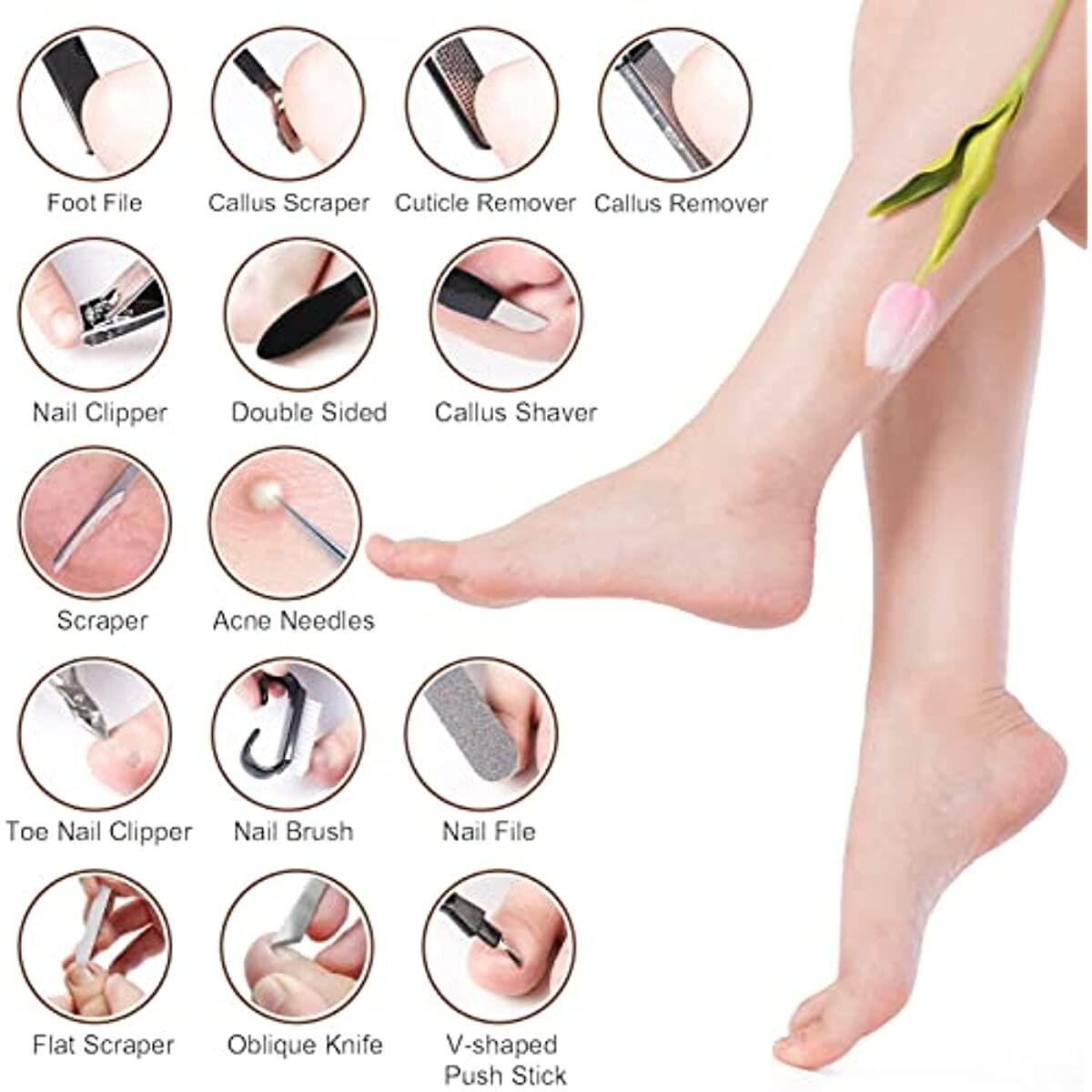
36 PCS PEDICURE TOOLS TO MEET YOUR EVERYDAY DIFFERENT NEEDS
This is a set of 36 pcs nail polishing tool, this professional nail polishing tool can meet your needs. Lightweight and compact, make it more comfortable to hold. The pedicure set can easily remove calluses and rough skin on the soles of the feet, making the hands and feet skin smoother and more natural.
CORRECT USE OF OUR 36 IN 1 PEDICURE SETS WILL KEEP YOUR FEET SMOOTH
- Firstly, we recommend to soak your feet in warm water for 10-15 mins to soften skin before using a foot spa kit.
- After scrubbing the calluses and dead skin, use the fine foot file side to smooth your feet to get the best pedicure.
- For a better result, put some moisturizer or foot cream to keep the softness.
- Callus scrapers, blades and nail clippers are very sharp, please use them gently and keep them away from children.
KEEP YOUR FEET SMOOTH
- Enjoy your foot pedicure spa, which is also a good choice for your family and friends.
- Reminder: Before using the pedicure tool, it is best to soak in warm water for 10-20 minutes to make the effect better.
HELP A WIDE RANGE OF FOOT PROBLEMS
- Common foot problems: thick corn, calluses, dead skin, rough skin.
- Pedicure tools can keep your skin smooth and make you more confident in bare feet.
SOAK IN WARM WATER
- It is recommended to soak your feet in warm water before using the foot pedicure kit.
- Use some foot cream to keep your feet a good status.
PROFESSIONAL PEDICURE TOOLS
- The 36 in 1 pedicure kit contains a variety of tools, each with its own unique functions, allowing you to experience professional care.
- The storage box is convenient for quick storage and use, suitable for family and professional use.
HIGH-QUALITY MATERIAL TOOLS
- The pedicure set is made of high-quality stainless steel and ABS materials to provide you with a long-lasting experience.
- It has the characteristics of being washable, not easy to rust, and wear-resistant.
REPLACEMENT STEPS
- Be careful not to get scratched when replacing. There is a silicone gasket inside the package to protect you.
- Use the right tools to keep your feet smooth.
See what our users are saying!

Raymond

Taylor

Karen

Amber

Chalida

Tanya

Lena

Daniella

Maxenne
You'd like to get access to hundreds of deals?
Join tens of thousands of smart and happy shoppers! What are you waiting for?
Sign Up Now!More from that seller...


Discover more deals...


So, what are you waiting for?
Sign Up Now!Be part of RebateKey
Join tens of thousands of smart and happy shoppers! What are you waiting for?
Start Now!