
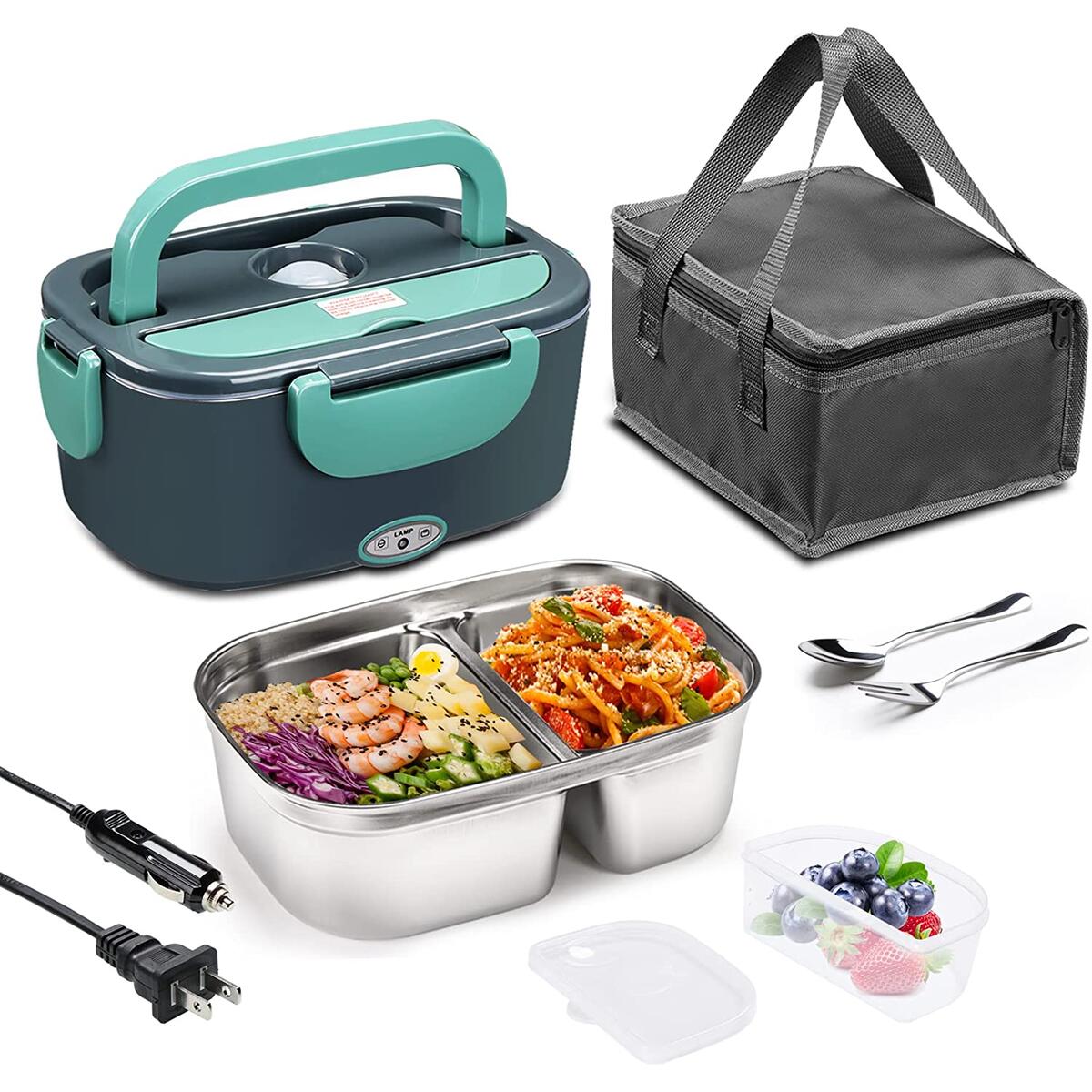


Electric Lunch Box 60W Food Heater, 2 Compartments Portable Heated Lunch Box for Car Truck Adults Work Travel, Leak Proof, Self Heating Lunch Box with 1.5L 304 SS Container, 110V/220V/12V/24V-Upgraded
$32.98
$19.79
Note: You have to register with RebateKey.com to be able to claim a coupon for Electric Lunch Box W.
Updated Electric Lunch Box:
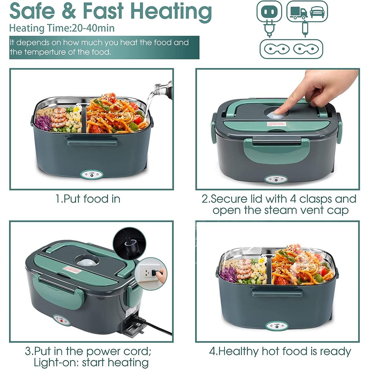
60W Fast Heating, More Efficient: Using 60W high-power PTC original constant temperature heating system, heating food for 20-40 minutes, super efficient and energy-saving.
Two Compartments Design: The two compartments are designed to separate different foods and prevent food from mixing tastes.
Removable: The electric heating lunch box features detachable design for easy dining and cleaning.
Leak Proof: Silicone cover leak-proof design, and curry rice, noodles, beef stew, and potato soup can be easily carried.
1.5L Large Capacity: 1.5L capacity is large enough. The heated lunch box is perfect for adults, men, women, school students, company office employees, construction worker and car drivers and so on.
Specifications:
Material: Food grade PP material and 304 stainless steel
Voltage: Support both car/truck use 12V/24V + home use 110V/220V
Power Rating: 60W
Capacity: 1.5L / 0.45L
Heating Time: About 15-35Minutes
How to use the electric lunch box ?
1.Put the Food in the electric lunch box.
2. Add a little water first, then close the lid.
3. Plug the cable, open the steam vent cap.
4. When the indicator light is on , heating is started. Heating about 15-35 minutes.
5. Unplug the power cord after heating is complete.
Package Included:
1 * Electric lunch box
1 * 304 Stainless Steel Food Container(1.5L) & Fruit Box(0.45L)
1 * 304 Stainless Steel Spoon & Fork
1* Insulated Lunch Bag
1 * Car/Truck Charger
1 * Home Use Adapter
1 * Manual
See what our users are saying!

Raymond

Karen

Lena

Chalida

Amber

Daniella

Tanya

Maxenne

Taylor
You'd like to get access to hundreds of deals?
Join tens of thousands of smart and happy shoppers! What are you waiting for?
Sign Up Now!Discover more deals...


So, what are you waiting for?
Sign Up Now!Be part of RebateKey
Join tens of thousands of smart and happy shoppers! What are you waiting for?
Start Now!