
Best US Deals, Coupons and Promo Codes
Find Great Deals in a Flash! Check out the Coupons and Promo Codes offered by Amazon, Walmart, eBay and more. At RebateKey.com, we offer the best product deals, online coupons, and promo codes directly from merchants, including Macy's, Amazon, Best Buy, Walmart and thousands of other popular brands! Sign Up Now, it's FREE


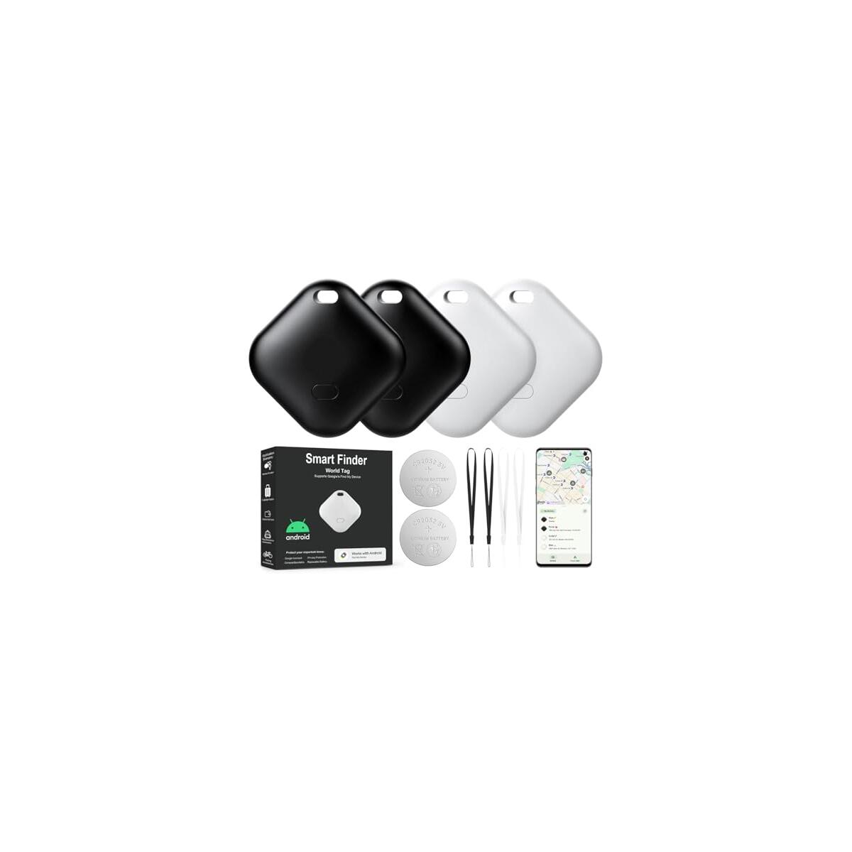
![2025 New [Apple MFi Certified] (iOS Only) Air Tracker Tags-4 Pack, Bluetooth Tracker for Apple Find My, Key Finder and Item Locator Smart Tag for Vehicles, Wallet, Keys, Luggage, Suitcases](https://rebatekey-production.s3.us-east-2.amazonaws.com/files/coupons/1/f/e/t/h/1feth.jpg)
No more deals
No more pages to load
Install RebateKey Chrome Extension to unlock Cashback Rebates, Coupons, Daily Deals, Discounts and Amazon Promo Codes automatically!
Get Chrome ExtensionBe part of RebateKey
Join tens of thousands of smart and happy shoppers! What are you waiting for?
Start Now!